Ford Foundation Annual Report (Site of the Day - Jul 12, 2012) — UI design breakdown
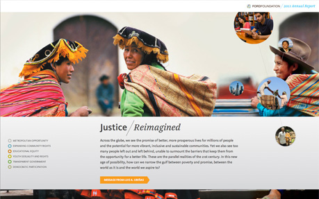
This year we were glad to work with The Ford Foundation again, helping them realize their annual report for the second year in a row. Ford is one of the largest charitable foundations in the world with a history of affecting global social change for the better. To accompany the printed version of The Ford Foundation's 2011 annual report, we designed a standalone site that communicates their story and allows for a greater level of interaction with their audience. Designed to take advantage of the latest in web-technologies (Parallax scrolling, HTML5 and responsive layout), we were able to bring their message to life in new ways. The site includes three interactive maps to explain: their initiative to bring India's rural communities together, their campaign to fight child marriage and their work in Indonesia, changing the lives of citizens by allowing them to be a part of their own government. It also features videos and an interactive timeline. Sourced from Awwwards. Use this page as a UI breakdown: reverse-engineer hierarchy, color roles, and interaction cues before you remix ideas into your own screens.
- Study how Ford Foundation Annual Report separates primary actions from secondary content—note spacing, type scale, and focal contrast. Recognized as Site of the Day - Jul 12, 2012.
- Extracted palette (#987654, #9C9C9C): check which hues carry brand vs utility chrome.
- Darkest #987654 vs lightest #9C9C9C sits around 1.5:1, which is soft—better for backgrounds than small body copy.
- Ask: what would break first if this layout were a product dashboard—navigation clarity, scan order, or color contrast?
- Related themes: Institutions, Clean, Flexible, Fullscreen, Icons, Infinite Scroll.