Google Fonts (Site of the Day - Aug 17, 2016) — UI design breakdown
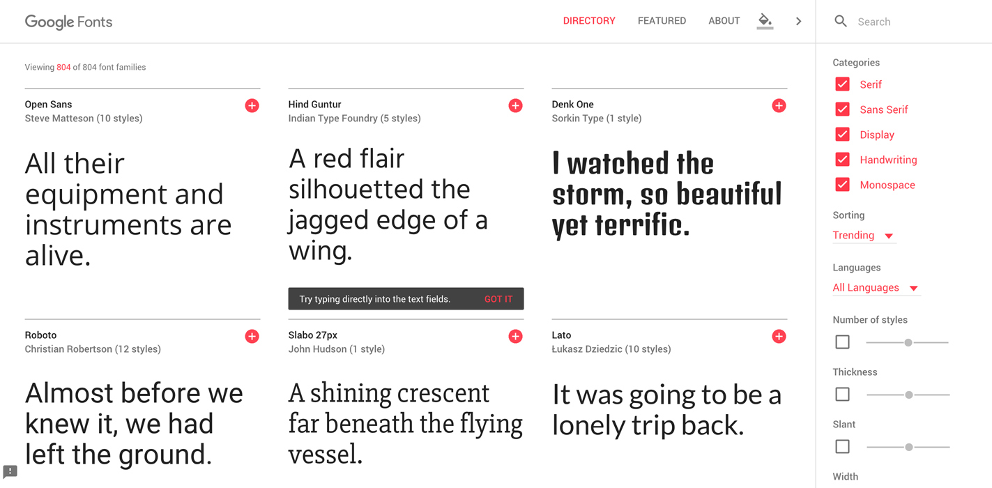
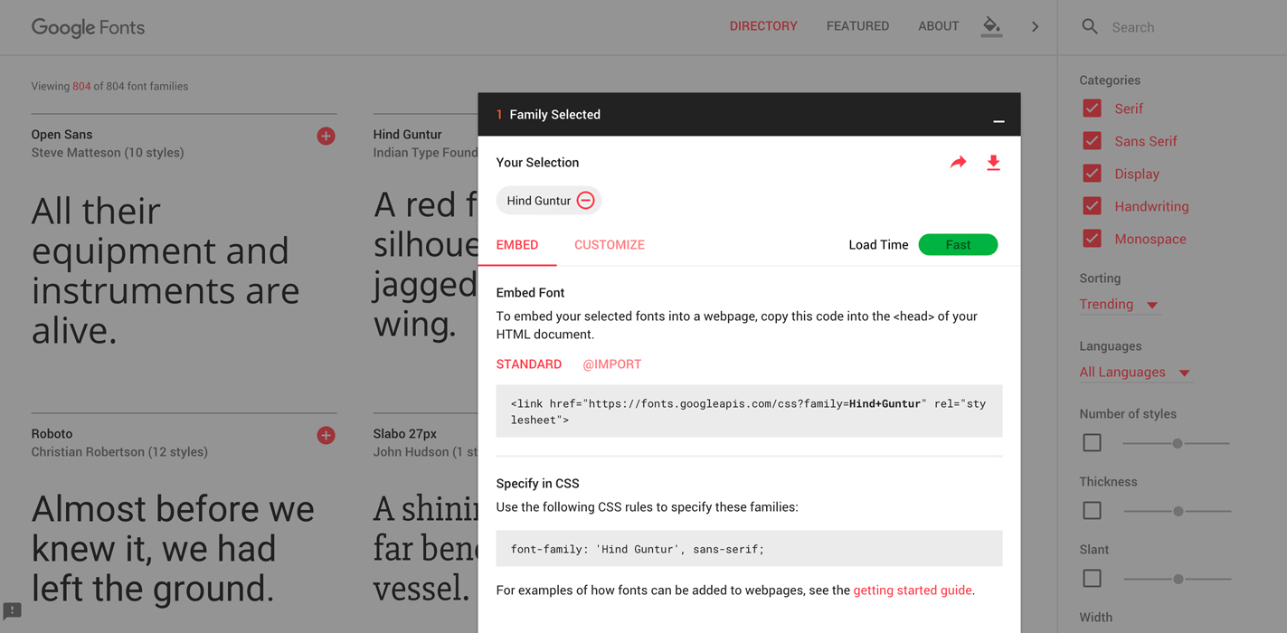
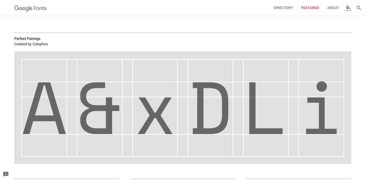
We believe the best way to bring personality and performance to websites and products is through great design and technology. Our goal is to make that process simple, by offering an intuitive and robust directory of open source designer web fonts. Sourced from Awwwards. Use this page as a UI breakdown: reverse-engineer hierarchy, color roles, and interaction cues before you remix ideas into your own screens.
- Study how Google Fonts separates primary actions from secondary content—note spacing, type scale, and focal contrast. Recognized as Site of the Day - Aug 17, 2016.
- Extracted palette (#D14836, #FFFFFF): check which hues carry brand vs utility chrome.
- Darkest #D14836 vs lightest #FFFFFF sits around 4.5:1, which is closer to large-text / UI-component contrast.
- Ask: what would break first if this layout were a product dashboard—navigation clarity, scan order, or color contrast?
- Related themes: Art & Illustration, Clean, Typography, Angular, Lo-dash.