Jean-Jacques Rousseau (Site of the Day - Sep 21, 2012) — UI design breakdown
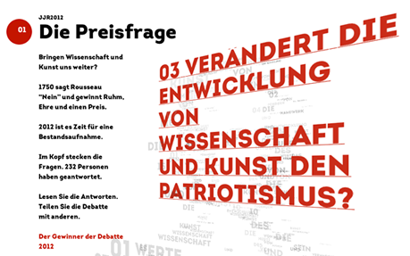
On Swiss Televistion and Radio there were special programms about Jean-Jacques Rousseau, as well as documentaries and talkshows. The question was how to get Rousseau online. We launched a competition. The goal was to answer the questions Rousseau did 200 years ago. The questions had to be selected out of his head, whitch formed his silhouette. After picking a question each person had the chance to write an answer and create a profile. The uploaded profile picture was rendered into a wordcloud with the words from the written answer. The community had the opportunity to vote for each profile, either positiv or negativ. It depended on the quality of the answer. The more answers you wrote the better chance you had to win. Sourced from Awwwards. Use this page as a UI breakdown: reverse-engineer hierarchy, color roles, and interaction cues before you remix ideas into your own screens.
- Study how Jean-Jacques Rousseau separates primary actions from secondary content—note spacing, type scale, and focal contrast. Recognized as Site of the Day - Sep 21, 2012.
- Extracted palette (#000, #D14836, #FFFFFF): check which hues carry brand vs utility chrome.
- Darkest #D14836 vs lightest #FFFFFF sits around 4.5:1, which is closer to large-text / UI-component contrast.
- Ask: what would break first if this layout were a product dashboard—navigation clarity, scan order, or color contrast?
- Related themes: Art & Illustration, Animation, Flexible, Responsive Design, Trend, Typography.