Karina Sirqueira Gallery (Site of the Day - Sep 11, 2022) — UI design breakdown
It has been exciting to work on this project, where you can see new patterns, different navigations, shapes, motion, and visuals. Welcome to my new work gallery! Sourced from Awwwards. Use this page as a UI breakdown: reverse-engineer hierarchy, color roles, and interaction cues before you remix ideas into your own screens.
- Study how Karina Sirqueira Gallery separates primary actions from secondary content—note spacing, type scale, and focal contrast. Recognized as Site of the Day - Sep 11, 2022.
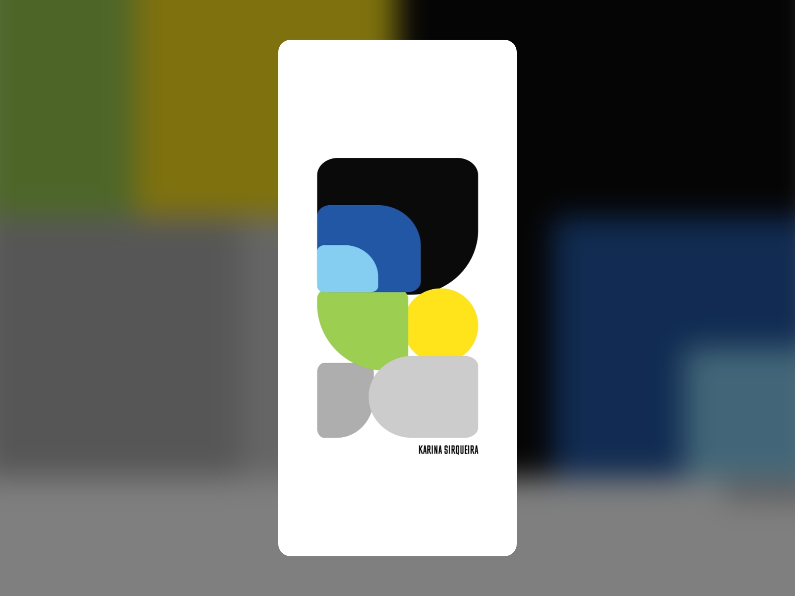
- Extracted palette (#FFFFFF, #000000): check which hues carry brand vs utility chrome.
- Darkest #000000 vs lightest #FFFFFF sits around 21.0:1, which exceeds WCAG AAA for normal text.
- Ask: what would break first if this layout were a product dashboard—navigation clarity, scan order, or color contrast?
- Related themes: Art & Illustration, Design Agencies, Animation, Clean, Colorful, Portfolio.