P.O.C. (Site of the Day - Jan 24, 2016) — UI design breakdown
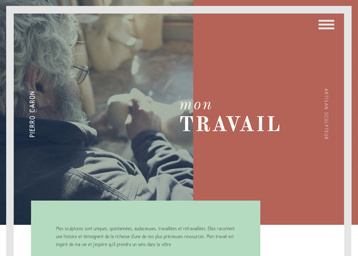
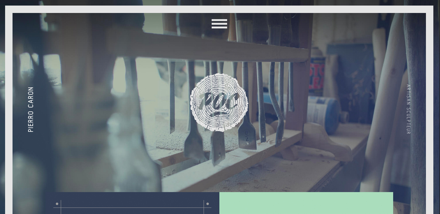
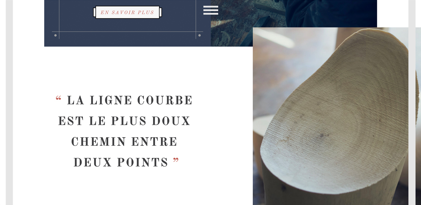
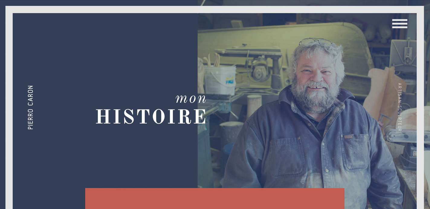
P.O.C. | Portfolio of an eccentric woodworker Sourced from Awwwards. Use this page as a UI breakdown: reverse-engineer hierarchy, color roles, and interaction cues before you remix ideas into your own screens.
- Study how P.O.C. separates primary actions from secondary content—note spacing, type scale, and focal contrast. Recognized as Site of the Day - Jan 24, 2016.
- Extracted palette (#49C5B6, #DF6C4F, #FFFFFF): check which hues carry brand vs utility chrome.
- Darkest #DF6C4F vs lightest #FFFFFF sits around 3.3:1, which is closer to large-text / UI-component contrast.
- Ask: what would break first if this layout were a product dashboard—navigation clarity, scan order, or color contrast?
- Related themes: Art & Illustration, Fullscreen, Portfolio, Responsive Design, Trend, CSS.