
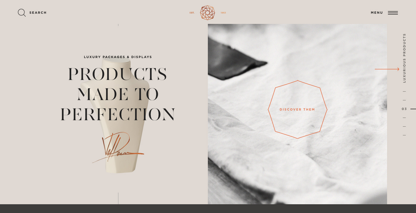
PAPAZIAN JEWELRY DISPLAYS (Site of the Day - May 22, 2016) — UI design breakdown
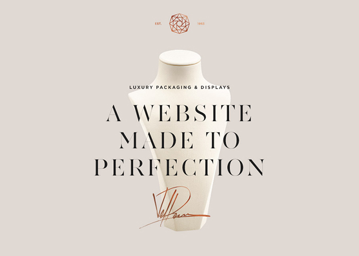
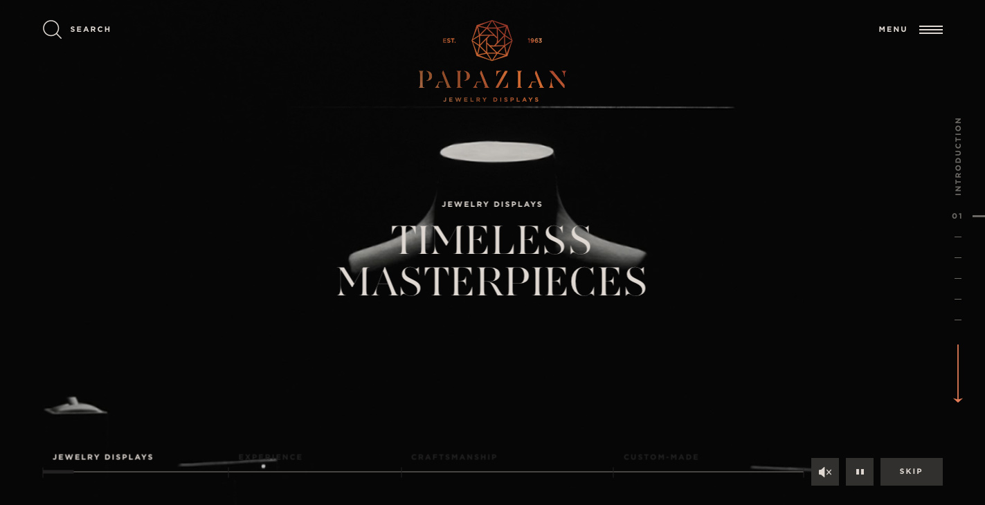
The company Papazian, produces a great variety of jewellery mannequin and display bases. Since 1963, Papazian produces and distributes its creations to the most important and well known jewellers all over the world. All of their creations share a common vision and have the ultimate aim to help their clients reach their audience. Sourced from Awwwards. Use this page as a UI breakdown: reverse-engineer hierarchy, color roles, and interaction cues before you remix ideas into your own screens.
- Study how PAPAZIAN JEWELRY DISPLAYS separates primary actions from secondary content—note spacing, type scale, and focal contrast. Recognized as Site of the Day - May 22, 2016.
- Extracted palette (#000, #DF6C4F, #FFFFFF): check which hues carry brand vs utility chrome.
- Darkest #DF6C4F vs lightest #FFFFFF sits around 3.3:1, which is closer to large-text / UI-component contrast.
- Ask: what would break first if this layout were a product dashboard—navigation clarity, scan order, or color contrast?
- Related themes: Business & Corporate, Fashion, Web & Interactive, Animation, Graphic design, Parallax.


