Psych & Psych (Site of the Day - Feb 6, 2012) — UI design breakdown
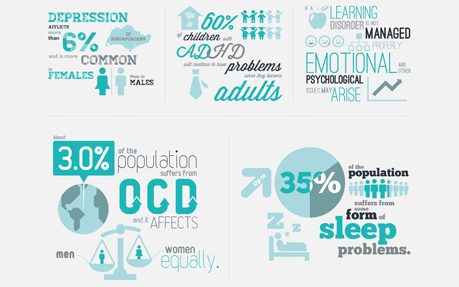
To make psychology digestible for the mass audience, we pop key symptoms of mental conditions that are normally confused with daily obstacles as question of interest. We then bundled the Q&A in lighthearted info graphics illustrated from long write-ups and local statistics. Sourced from Awwwards. Use this page as a UI breakdown: reverse-engineer hierarchy, color roles, and interaction cues before you remix ideas into your own screens.
- Study how Psych & Psych separates primary actions from secondary content—note spacing, type scale, and focal contrast. Recognized as Site of the Day - Feb 6, 2012.
- Extracted palette (#49C5B6, #FFFFFF): check which hues carry brand vs utility chrome.
- Darkest #49C5B6 vs lightest #FFFFFF sits around 2.1:1, which is soft—better for backgrounds than small body copy.
- Ask: what would break first if this layout were a product dashboard—navigation clarity, scan order, or color contrast?
- Related themes: Design Agencies, Minimal, Typography, CSS, HTML5.