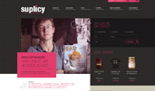
Suplicy Special Coffe (Site of the Day - Nov 28, 2010) — UI design breakdown
[gallery columns="2"] Suplicy is a different brand that isn’t just a coffee place, neither is it just a coffee or gifties brand. Click and discover. Sourced from Awwwards. Use this page as a UI breakdown: reverse-engineer hierarchy, color roles, and interaction cues before you remix ideas into your own screens.
- Study how Suplicy Special Coffe separates primary actions from secondary content—note spacing, type scale, and focal contrast. Recognized as Site of the Day - Nov 28, 2010.
- Extracted palette (#9C9C9C): check which hues carry brand vs utility chrome.
- Ask: what would break first if this layout were a product dashboard—navigation clarity, scan order, or color contrast?
- Related themes: Hotel / Restaurant, Other.