
The Happy Forecast (Site of the Day - Jul 13, 2015) — UI design breakdown
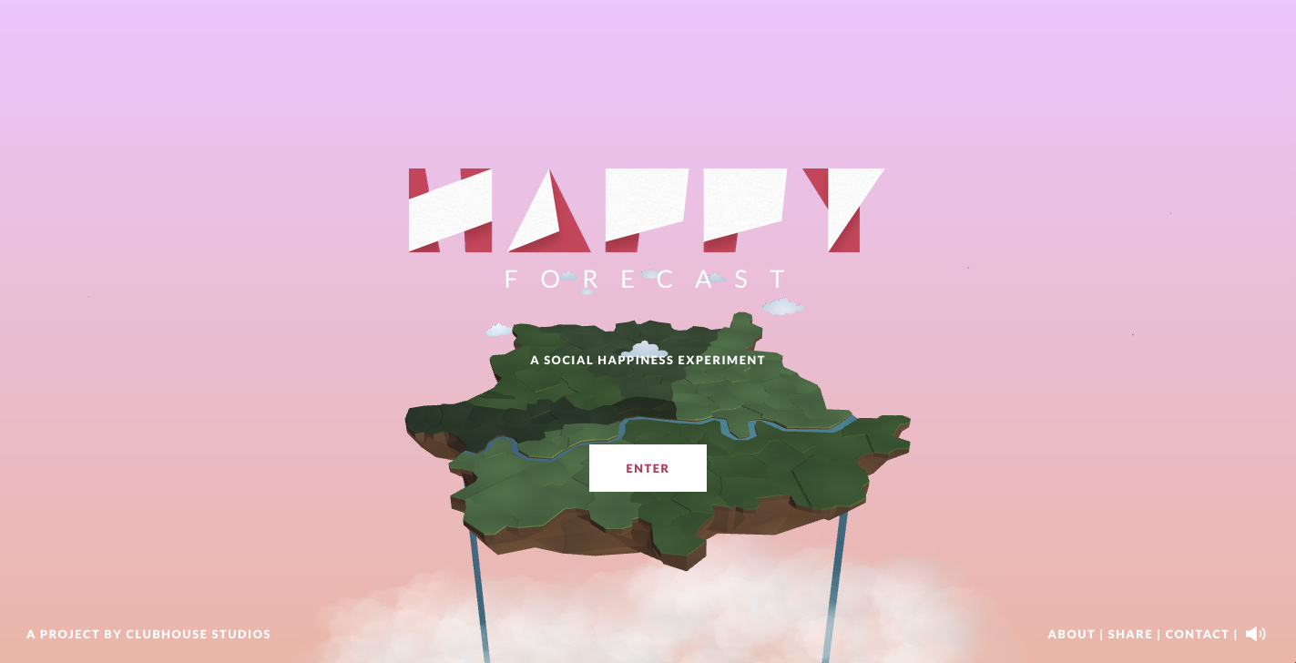
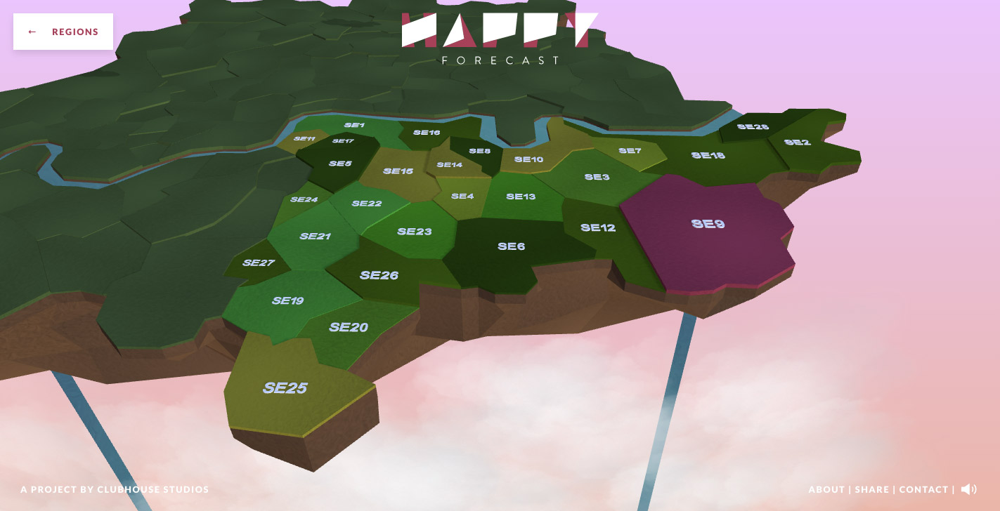
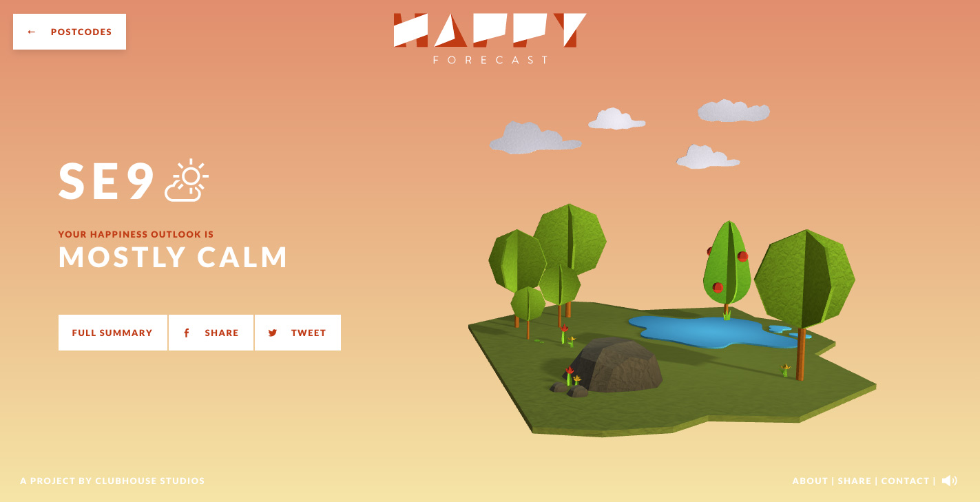
The Happy Forecast visualizes over 700 hours of observational research to forecast the areas of London best for social wellbeing and long-term happiness. Real-time sentiment analysis of Tweets sit alongside live house pricing data allowing Londoners to compare the cost of living against the communities that inhabit each postcode. Sourced from Awwwards. Use this page as a UI breakdown: reverse-engineer hierarchy, color roles, and interaction cues before you remix ideas into your own screens.
- Study how The Happy Forecast separates primary actions from secondary content—note spacing, type scale, and focal contrast. Recognized as Site of the Day - Jul 13, 2015.
- Extracted palette (#2779A7, #49C5B6, #FFFFFF): check which hues carry brand vs utility chrome.
- Darkest #2779A7 vs lightest #FFFFFF sits around 4.8:1, which meets WCAG AA for normal text.
- Ask: what would break first if this layout were a product dashboard—navigation clarity, scan order, or color contrast?
- Related themes: Culture & Education, Technology, Web & Interactive, Animation, Clean, Unusual Navigation.


