
A dashboard should help a specific person make a specific decision. If every metric is equally loud, none of them are useful. Hierarchy, density, and defaults matter more than charts.
Topic
Dashboards
SaaS dashboards, hierarchy, metrics, and operational interface design.
UI Coach guides
Start here
GuideUI CoachDashboards
SaaS Dashboard Design Best Practices
How to design a SaaS dashboard that helps someone decide, instead of displaying every metric at the same volume.
Read the guide
From the community
Latest articles
Unbounce · Danielle Torrie · Apr 13, 2026
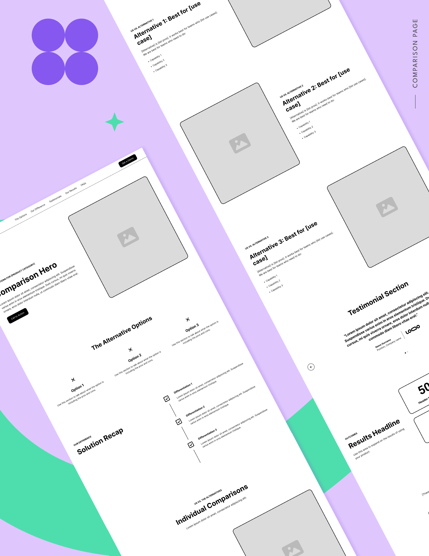
How to build SaaS comparison pages buyers actually trust
When most SaaS marketers hear “comparison page,” they think of a one-to-one matchup: your company vs. a competitor. Usually, that means a feature table stacked in your favor, a list of reasons the other tool doesn’t measure up, and a CTA designed to push the buyer toward your product. Buyers have seen that playbook to.
Read
Webflow Blog · 8d
7 best membership and paywall platforms for SaaS and subscription sites
Compare the 7 best membership and paywall platforms for websites based on what you are gating.

Read
Eleken · Jun 12, 2026
Types of SaaS Software: Categories and Examples
What are the types of SaaS software, their differences, and similarities? Explore the real-world examples of SaaS solutions and their main features.

Read
Eleken · Jun 12, 2026
50 Login Page Examples with Modern UI Patterns for SaaS and Web Apps
Browse the best login page designs from real products. We’ve gathered 50+ examples with expert notes and UI patterns that work.
Read
Eleken · Jul 31, 2026
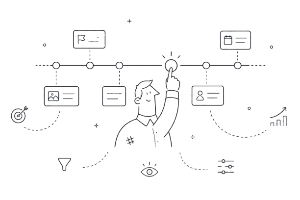
Timeline UI Design: Best Patterns, Examples, and UX Practices for Modern Products
Explore timeline UI patterns, real examples, and UX best practices to design clear, scalable timelines for SaaS, dashboards, roadmaps, and activity feeds.
Read
Webflow Blog · Aug 5, 2026
AI adoption isn't the same as AI usage
Usage dashboards go up while nothing about how your team ships changes. Why that gap exists, and the one kind of AI adoption that actually lasts.
Read
CSS Wizardry · Jun 1, 2026
Front-End’s Missing Metric: The TBT Window
The TBT Window is the FCP-to-TTI interval used to calculate Total Blocking Time. If FCP or TTI moves, TBT can change even when long tasks do not.
Read
Eleken · Jul 10, 2026
Top 7 SaaS Design Agencies (Recommended by Industry Experts)
Looking for a trustworthy and skilled SaaS design agency to match your business requirements? Check out this list made by our designers.

Read
Slack Design · lcarmen2 · Apr 13, 2023
How we design for admin experiences: baking good content into the process
Hi, my name is Stella, a designer working on the Slack platform administration experience. My job is to take care of a special group of users, our Slack administrators. While many think of Slack as a “people product,” we’re also a robust enterprise product. According to Okta’s 2022 Business at Work report, the average.
Read
Webflow Blog · May 9, 2026
How to stream live Postgres changes to a Webflow Cloud dashboard with Supabase
Learn how to build a live data dashboard on Webflow Cloud using Supabase Realtime.
Read
Eleken · Jun 12, 2026
100 SaaS Solopreneur Ideas for Your Next Startup
Discover opportunities to create profitable, one-person businesses with our comprehensive list of unique concepts.

Read
W3C WAI · Jul 30, 2026
Group Note Draft: Verifiable Credentials Overview v1.1
The family of W3C Recommendations for Verifiable Credentials, described in this overview document, provides a mechanism to express these sorts of credentials on the Web in a way that is cryptographically secure, privacy respecting, and machine-verifiable.
Read
Related roles
Current design jobs
11 active roles currently match product designer dashboard in the UI Coach job catalog.
Posted 20 hours ago
SynthesiaRemote
Product Designer, Enterprise (Staff-level / L6)
Remote · LondonFull Time
Product DesignStaff
Posted 4 days ago

Posted 8 days ago
Posted 9 days ago