Heydon Pickering · Jun 9, 2025
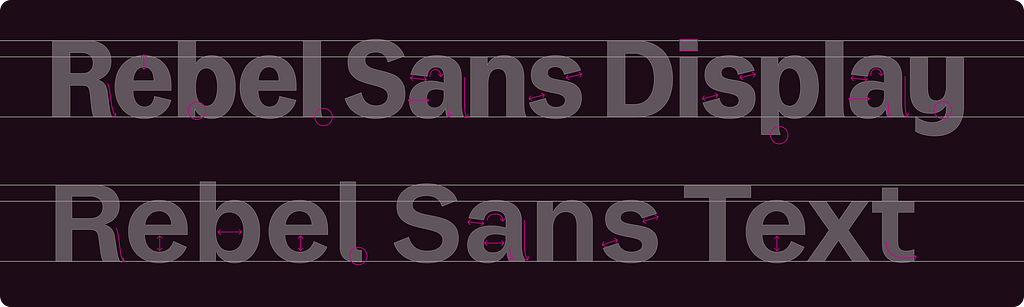
Skune: A hand drawn variable font
Skune is a variable font designed to have the jagged, frenetic appeal of lo-fi garage punk
Heydon Pickering · Jun 9, 2025
Skune is a variable font designed to have the jagged, frenetic appeal of lo-fi garage punk
Heydon Pickering · Jun 9, 2025
The relationship between shame and motivation in web development, especially regarding accessibility.

tempertemper · Martin Underhill · Jun 2, 2025
Despite WCAG’s guidance to avoid conveying information with colour alone, there’s a caveat that allows it, and I’m not a happy bunny!
WebAIM · John Northup · May 30, 2025
If you work in web accessibility, you’ve probably spent a lot of time explaining and implementing the ARIA roles and attributes that have been around for years—things like aria-label, aria-labelledby, and role="dialog". But the ARIA landscape isn’t static. In fact, recent ARIA specifications (especially ARIA 1.3) incl.
Microsoft Design · Microsoft Design · May 30, 2025
How we rebuilt the Microsoft 365 Copilot app for a new kind of productivity By Jon Friedman Read the full article on our new website here . The new Microsoft 365 Copilot app isn’t your typical redesign. From the introduction of net new experiences like Agents to a fresh look and feel rooted in Chat-based interactions,.
Microsoft Design · Microsoft Design · May 29, 2025
How we made digital text like printed words on paper By Tracy Jones Read the full article on our new website here . In the mid 1990’s, the rise of the internet tidal wave was growing high enough to kiss the sky. Cyberspace appeared like a slowly expanding phenomenon, but printing emails and web pages remained routine.
Ethan Marcotte · <name>Ethan Marcotte</name> · May 25, 2025
The original “Responsive Web Design” article was published fifteen years ago. Time’s weird, man.
tempertemper · Martin Underhill · May 25, 2025
We often reach for a tables when a list would be much more user friendly, and avoid potential WCAG issues.
Adam Silver · May 11, 2025
Last week I ran a Form Design Mastery live call with the UX team at Multiverse. Various members of the team shared their designs for me to review. Here I’ll show you Jamie’s redesign because it shows how good design leads to more problems. For context, the form allows users to log “off the job” learning. Here’s the or.
GOV.UK Accessibility Blog · <name>Kelly Clarkson, Senior Accessibility Specialist, Government Digital Services</name> · May 9, 2025
We asked information architects for advice on prioritising accessibility, educating teams, avoiding pitfalls, and using tools to ensure accessible information architecture.

tempertemper · Martin Underhill · Apr 29, 2025
Most people won’t need to know what focus priming is but it’s a useful way to test a website’s accessibility.
GOV.UK Accessibility Blog · <name>Kelly Clarkson, Senior Accessibility Specialist, Government Digital Services</name> · Apr 25, 2025
We asked frontend developers about the importance of semantic HTML, how they ensure code is accessible from the start of a project, and how they make dynamic content accessible.

A List Apart · by <a itemprop="url" class="author" rel="author" href="https://alistapart.com/author/liam-nugent/">Liam Nugent</a> · Apr 23, 2025
As a product builder over too many years to mention, I've lost count of the number of times I've seen promising ideas go from zero to hero in a few weeks, only to fizzle out within months. Financial products, which is the field I work in, are no exception. With people’s real hard-earned money on the line, user expecta.
iA · iA Inc · Apr 22, 2025
The highest distinction for pioneering designs

GOV.UK Accessibility Blog · <name>Samantha Merrett, Senior Accessibility Specialist, Ministry of Justice</name> · Apr 4, 2025
As we start thinking about Global Accessibility Awareness Day (GAAD) 2025, here are some tips for hosting accessible online events.

Ethan Marcotte · <name>Ethan Marcotte</name> · Mar 25, 2025
A peek into You Deserve a Tech Union ’s new design, and the typefaces—and process—that made it happen.
tempertemper · Martin Underhill · Mar 22, 2025
The web is a network of pages that are linked together, with those links often grouped in a navigation. Here’s how keyboard users traverse navigation.
UX Movement · anthony · Mar 19, 2025
When a sidebar contains many items, grouping is necessary to help users find them faster. However, most designers don’t group their sidebar items and force users to scan an entire list. This results in slow navigation times and poor findability. Grouping improves findability by enabling users to spot a group and scan.
UX Movement · anthony · Mar 19, 2025
How easy to scan is your sidebar menu? If you haven’t optimized the spacing, users will likely spend more time navigating and finding items. Balancing the spacing in the sidebar can help users navigate faster and easier. A typical mistake designers make is adding too much or not enough space. Both can make scanning fo.