UI Coach Logo

Learn the principles behind the interface

UX laws, made visual

Explore all UX laws

From design to website

Turn your UI designs into live websites.

Build visually in Webflow, just like you design. Fine-tune typography, spacing, layout, and interactions until everything looks right, then publish your site live.

Explore Webflow

Latest from the design community

UX Movement · anthony · Mar 19, 2025

How to Group Your Sidebar Items for Better Findability

When a sidebar contains many items, grouping is necessary to help users find them faster. However, most designers don’t group their sidebar items and force users to scan an entire list. This results in slow navigation times and poor findability. Grouping improves findability by enabling users to spot a group and scan.

Read

UX Movement · anthony · Mar 19, 2025

How to Make Any Sidebar Menu Easier to Scan

How easy to scan is your sidebar menu? If you haven’t optimized the spacing, users will likely spend more time navigating and finding items. Balancing the spacing in the sidebar can help users navigate faster and easier. A typical mistake designers make is adding too much or not enough space. Both can make scanning fo.

Read

Adam Silver · Mar 16, 2025

Why my own sign-up form sucks

Last Friday I received a message from Crystal, an accessibility engineer: As you probably gleaned from my post I am building my contact page right now for my development agency. […] ​ I have actually heard about your Form Design Patterns book from a co manager of mine at the Accessibility Book Club but I have got to b.

Read

Scott O'Hara · Scott O'Hara · Mar 14, 2025

Popping preconceived popover ponderings

I wrote much of this back in 2023 and 2024 while popover was still being implemented / was newly released. Since I began digitally scribbling my thoughts down, others ended up writing about the attribute - which was one of the reasons I didn’t feel any urgency in publishing my own post. Though, I did co-author one of.

Read

tempertemper · Martin Underhill · Mar 12, 2025

How button groups should work for keyboard users

Menubars, menus, toolbars, and tablists are part of a larger family of ‘button groups’. Here’s how they should behave when using the keyboard.

Read

Adam Silver · Mar 9, 2025

TireRack’s clever, conversion-boosting UX

Last week I saw this post on LinkedIn: I saw a clever conversion-boosting tactic on TireRack. It’s a perfect example of what happens when a marketer obsessively refines one small part of the buying experience until all friction has been eliminated. Along with the post the author shared a video demo. So let me show you.

Read

Adam Silver · Mar 2, 2025

If you’re struggling to write the content, you probably have an interaction problem

Last week I posted a UX challenge on LinkedIn. I received 177 responses from senior designers and content designers. But the best response came from Joyce, a self-proclaimed non-designer. The challenge was simple: === Which question label works best for ‘delivery’ and ‘collection’: === Now if you’re thinking that “Del.

Read

Adam Silver · Mar 2, 2025

If you’re struggling to write the content, you probably have an interaction problem

Last week I posted a UX challenge on LinkedIn. I received 177 responses from senior designers and content designers. But the best response came from Joyce, a self-proclaimed non-designer. The challenge was simple: === Which question label works best for ‘delivery’ and ‘collection’: === Now if you’re thinking that “Del.

Read

Intuit Design · Ted Drake · Feb 28, 2025

Ensuring Trust in AI with Inclusive Design

Trauma-informed design (TID) principles were established in architecture and service design with an emphasis on providing safe spaces for those who have suffered trauma. More recently, TID has been adopted within digital design of web and mobile applications. ‌The core principles of TID also lead to usable design that.

Read

WebAIM · Jared Smith · Feb 27, 2025

Global Digital Accessibility Salary Survey Results

In December 2024 WebAIM conducted a survey to collect salary and job-related data from professionals whose job responsibilities primarily focus on making technology and digital products accessible and usable to people with disabilities. 656 responses were collected. The full survey results are now available. This surv.

Read

Manuel Matuzovic · Feb 27, 2025

Is the button focusable?

Let’s play a game. I’ll hide a button using different techniques in HTML and CSS, and you have to guess whether it’s still focusable. That's our button. Catch me if you can Now, let's hide it. CSS First, we’ll use CSS to hide the button visually. We aim to ensure the button isn’t focusable when it’s not visible. So, i.

Read

tempertemper · Martin Underhill · Feb 23, 2025

Skip links: what, why, and how

Ever noticed one of those “Skip to main content” links when you press the tab key? They’re important.

Read

Adam Silver · Feb 3, 2025

Are there exceptions to the ‘avoid multi-column forms’ rule?

Last week I posted this on LinkedIn: === “Is a multi-column form layout good UX?” No. So why do designers do it? Because they want to avoid scrolling and fill up the whitespace (they think it looks better). But this isn’t for users. It’s for them. In reality multi-column form layouts: - are prone to error - are slower.

Read

WebAIM · George Joeckel · Jan 31, 2025

Join the Discussion—From Your Inbox

Which WebAIM resource had its 25th birthday on November 1, 2024? The answer is our Web Accessibility Email Discussion List! From the halcyon days when Hotmail had over 35 million users, to our modern era where Gmail has 2.5 billion users, the amount of emails in most inboxes has gone from a trickle to a […]

Read

Manuel Matuzovic · Jan 31, 2025

Building a progress-indicating scroll-to-top button in HTML and CSS

I noticed a nice detail on theneedledrop.com . They have a square scroll-to-top button with an arrow pointing right. The button's border is black, and the background color is white. When you scroll, the arrow points up, and the background color turns gradually yellow as you scroll. That's nothing too special, but it c.

Read

Adam Silver · Jan 26, 2025

My clever solution for handling multiple submit buttons

In 2009 I was working as a frontend engineer for an e-commerce agency and received this bug: The bug said: Pressing Enter when the ‘Town’ input is focused performs a postcode search Pressing Enter should only perform a postcode search when the postcode input is focused. This problem is harder than it sounds so let me.

Read

Slack Design · andyacevedo · Jan 23, 2025

Should we make it a preference?: On customization, defaults, and accessibility

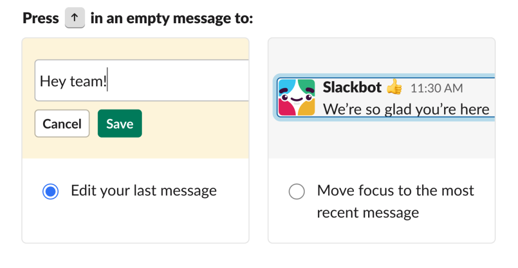
Design that is inclusive and accessible almost always works better for everyone. But once in a while we reach a genuine dilemma — the more technically accessible choice adds friction or breaks expectations for everyone else. In these moments, someone inevitably asks: Can we just make it a preference? “Make it a prefer.

Read

Adam Silver · Jan 19, 2025

Why the ‘none of the above’ checkbox pattern worries me

I recently read a blog post about how a GOV.UK service redesigned one of their questions in their application form. The original question looked like this: If you select ‘Yes’ you go here: Looks good. But research showed that some users who had a condition and were happy to disclose it, selected ‘No’ because they didn.

Read